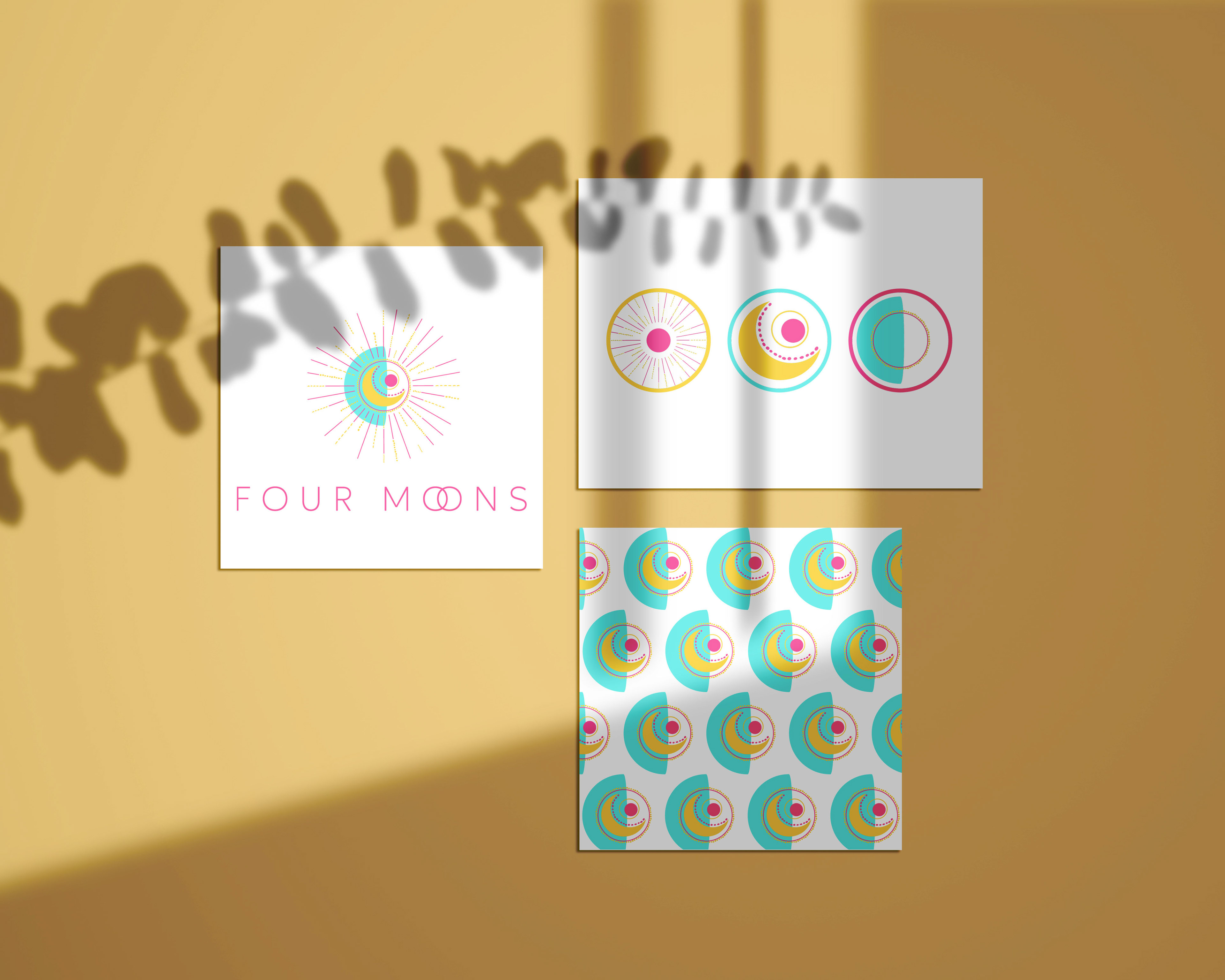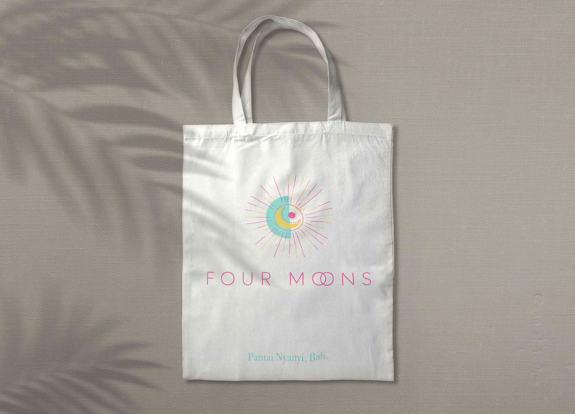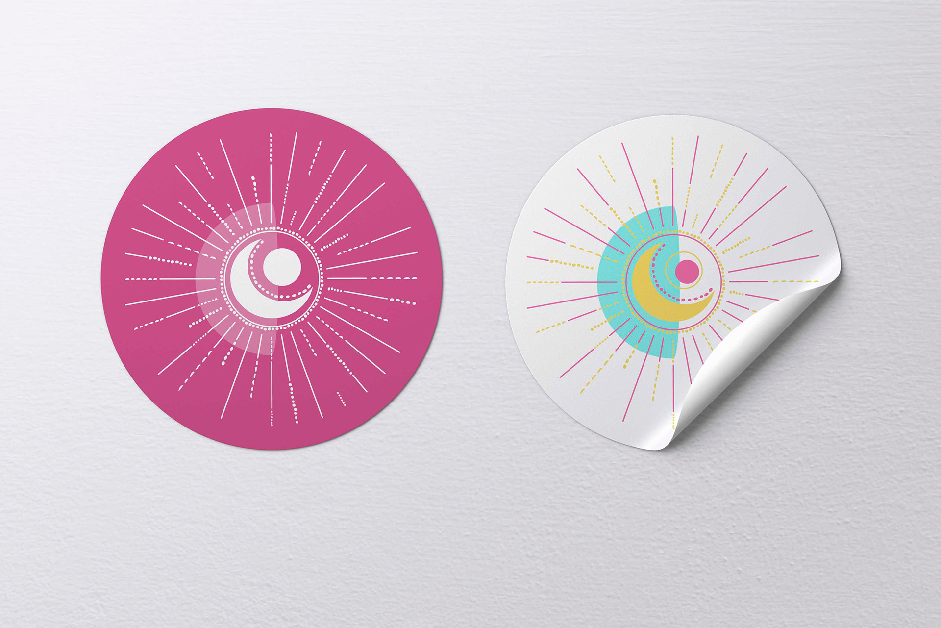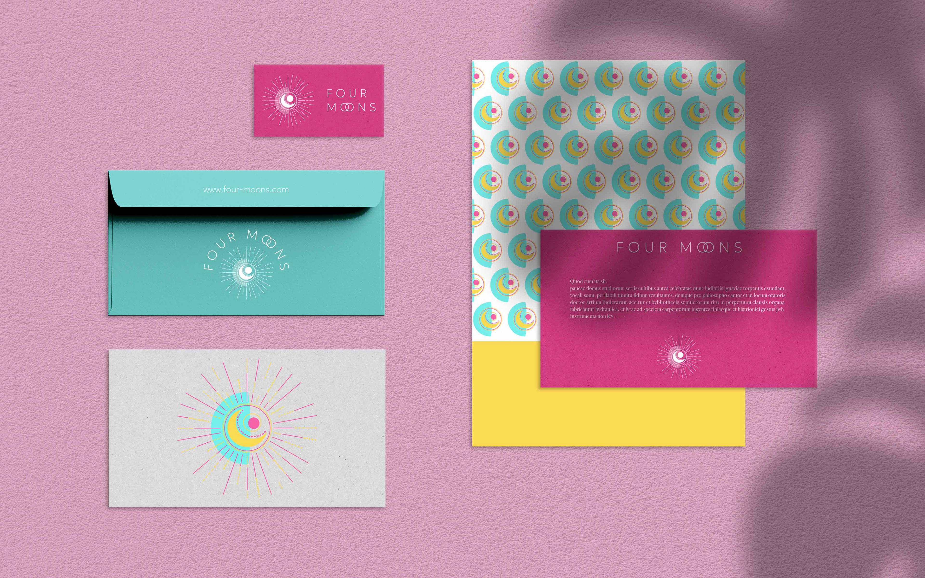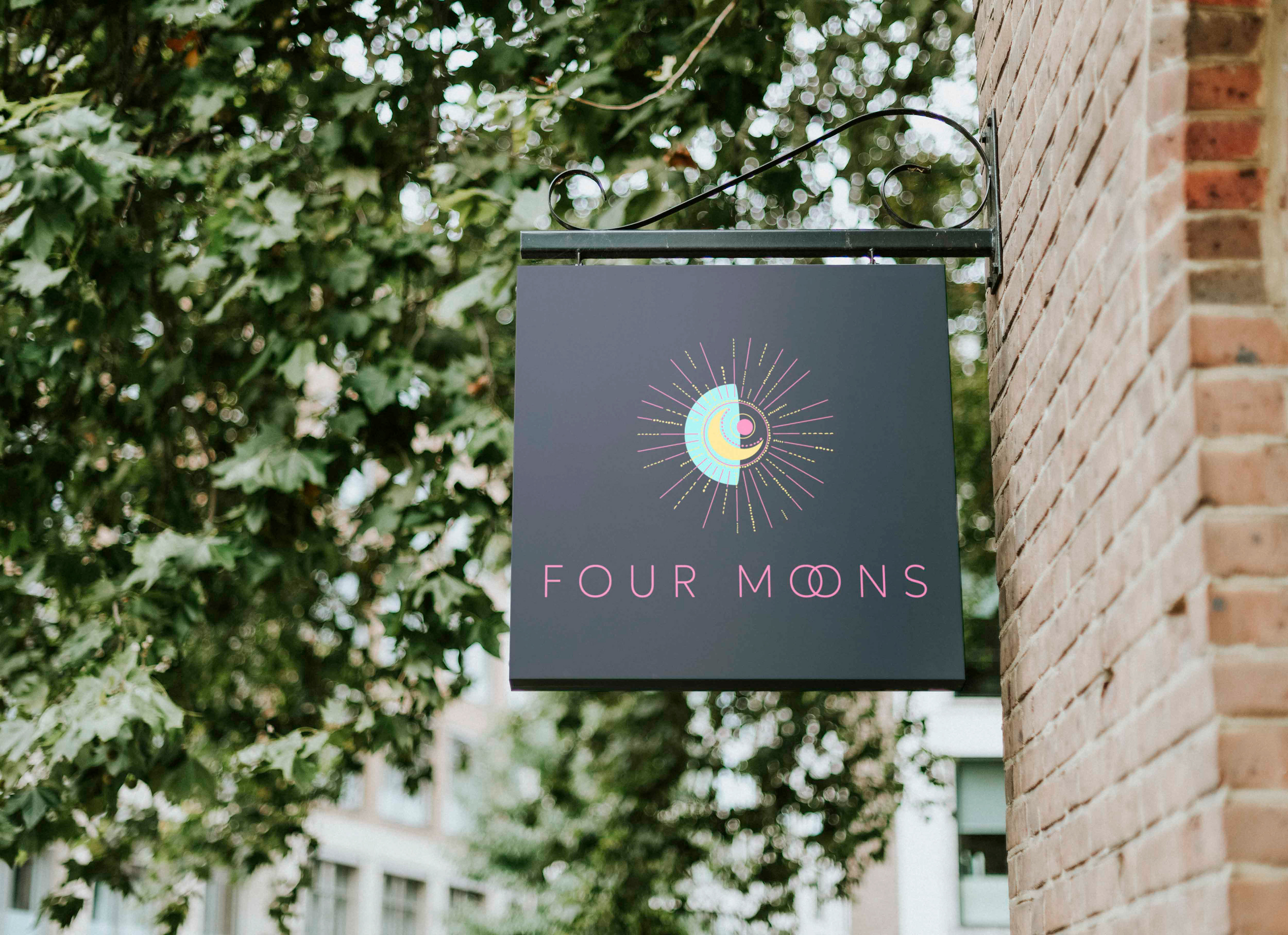
FOUR MOONS
LOGO, BRANDING, PATTERN DESIGN AND PACKAGING
Creation of the brand identity from A to Z. Four Moons is a restaurant serving organic food menus based on women's cycle phases. The moon is the holiest symbol of femininity, four moons refer to the four phases of the sacred feminine cycle, Eating food accordingly to where you are with your cycle will help you gain clarity and connection with your emotions and inner universe.The logo and branding are giving a feeling of energy with pop colors and femininity with the different moon shapes and the delicate dots. The rays symbolize the feminine sacred magic light, and all the dots the sparkle of energy. I designed their whole brand identity, and packaging.