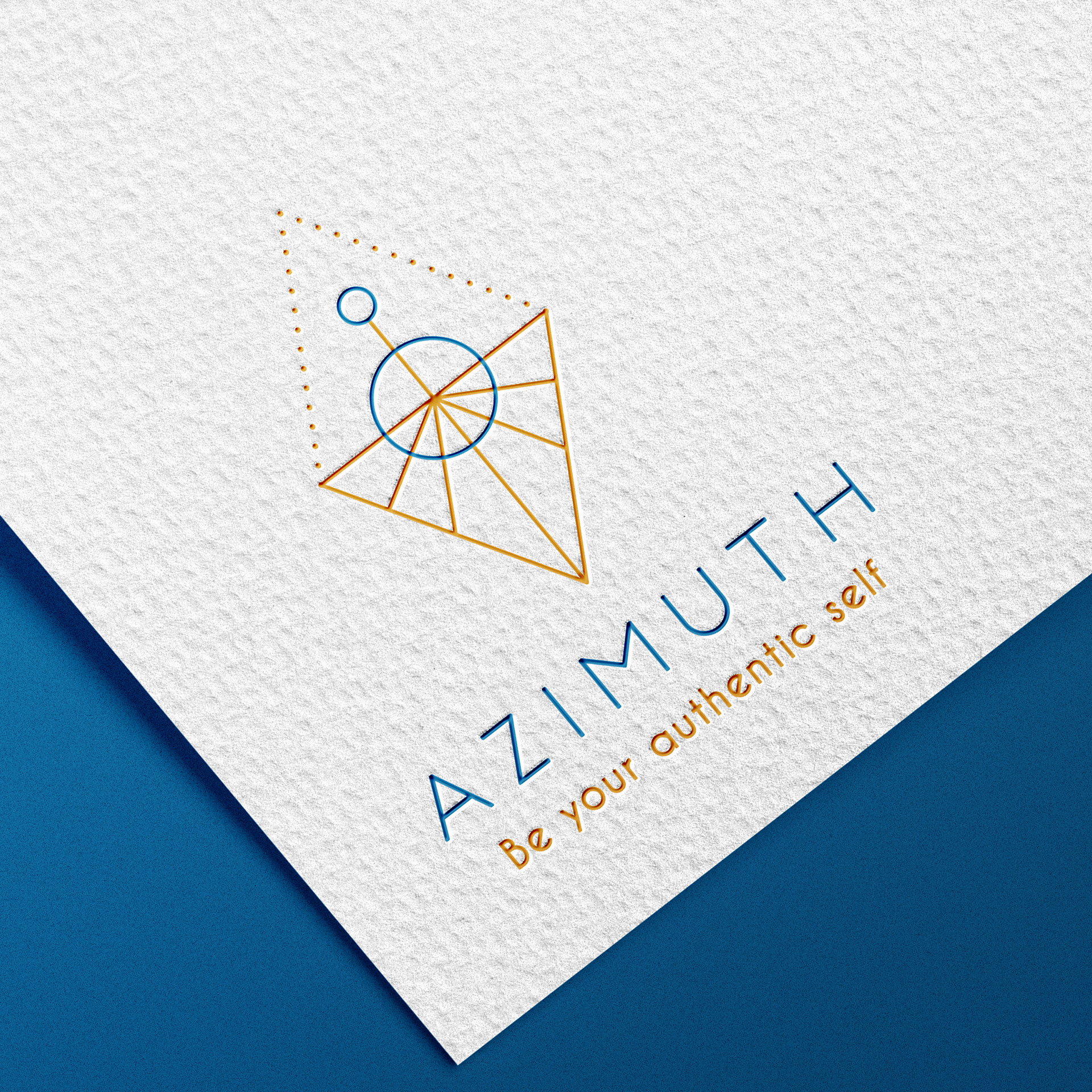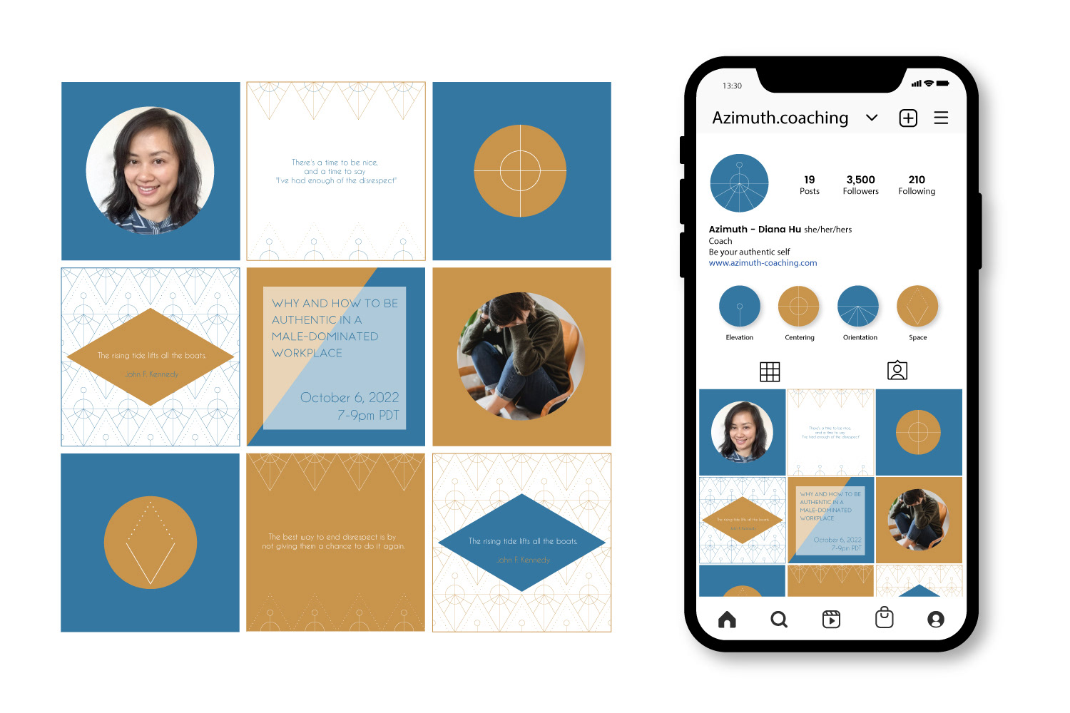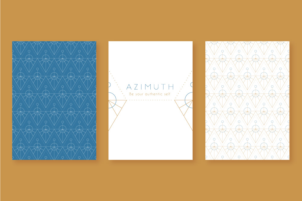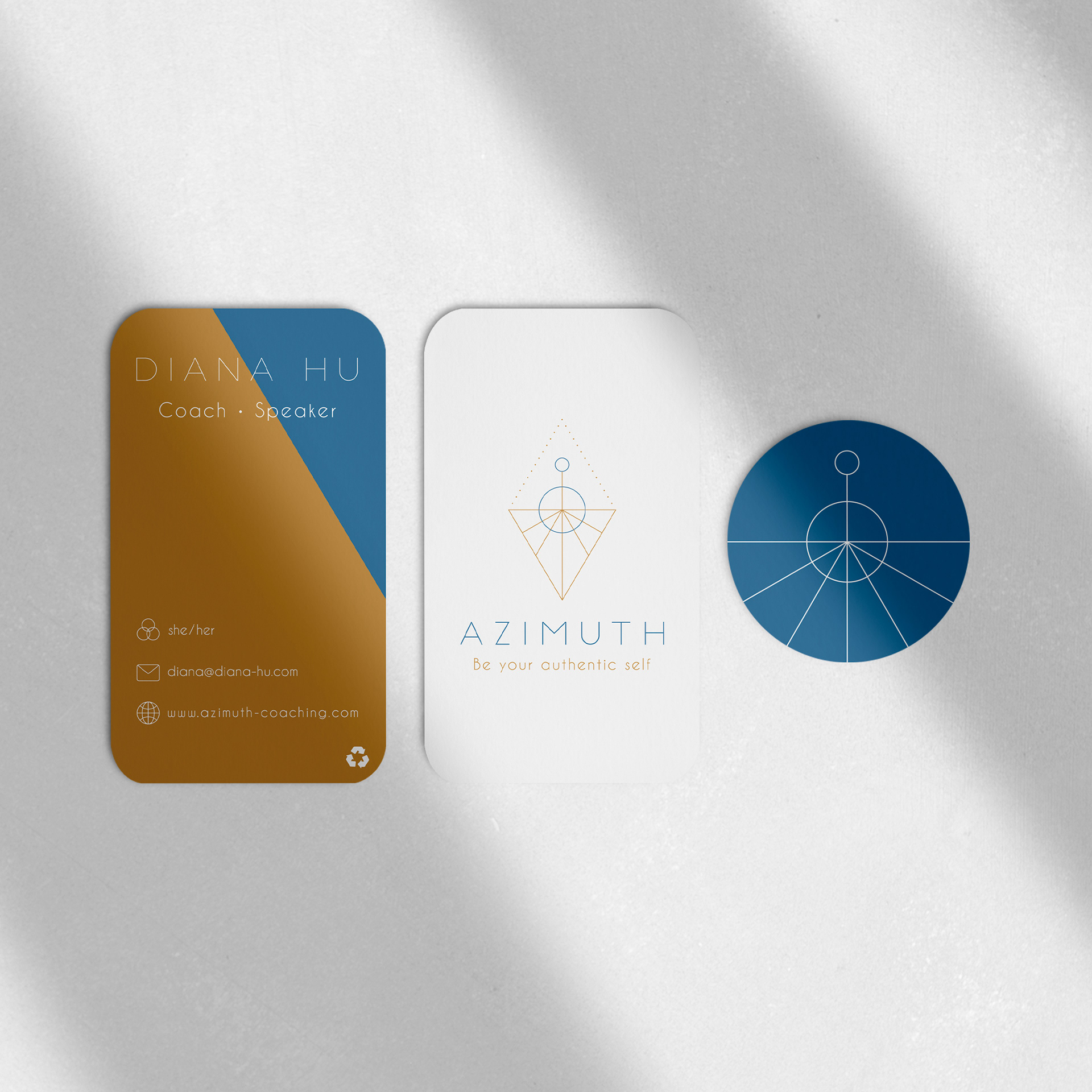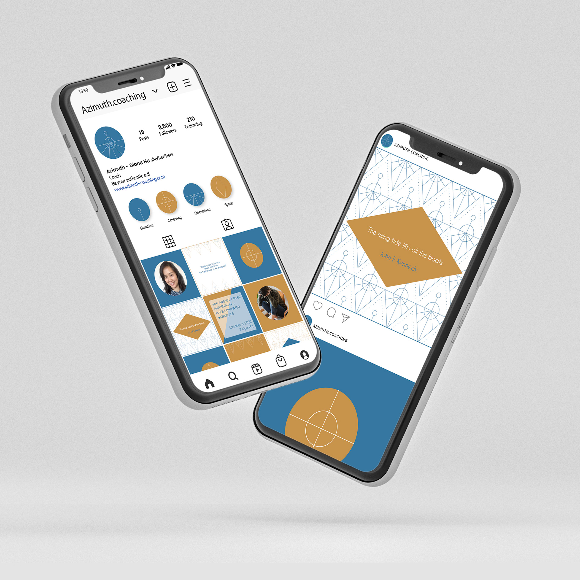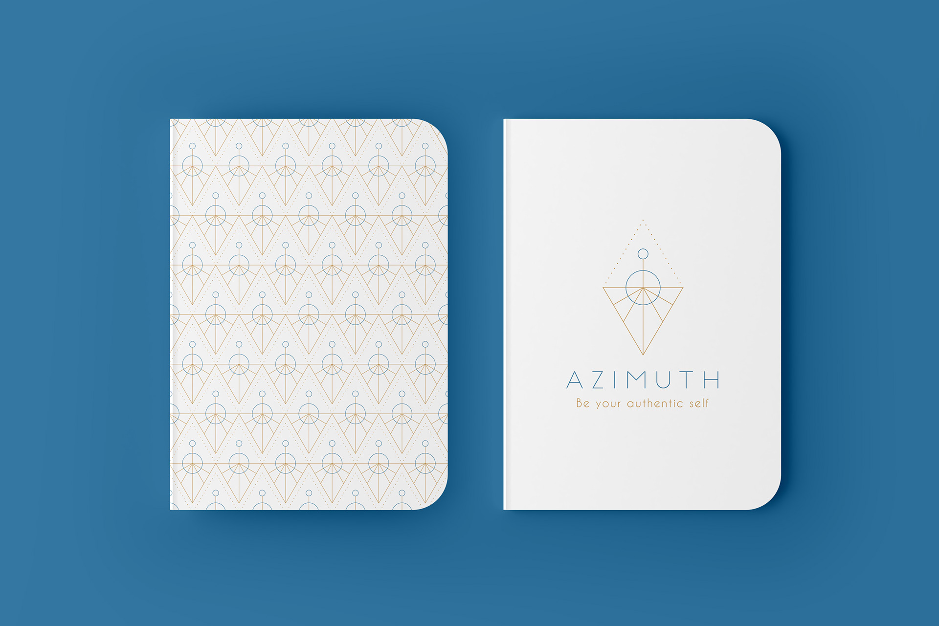
AZIMUTH COACHING
LOGO & BRANDING
Creation of the brand identity from A to Z. AZIMUTH is a coaching company, that offers both personal and professional coaching through the specter of being authentic to oneself. The Logo features a diamond shape evoking the four pillars of Azimuth coaching. The Upper circle is representing Elevation, the bigger circle stands for Centering, and the rays represent all the different directions and possible orientations. The middle where all the elements meet is a symbol of life and that Azimuth space you can create for yourself. The colors are grounding, warm, and gender-neutral. The overall feel of the logo is showing strength, uniqueness, and elevation.