FLIPSIDE
BRANDING, LOGO & PATTERN
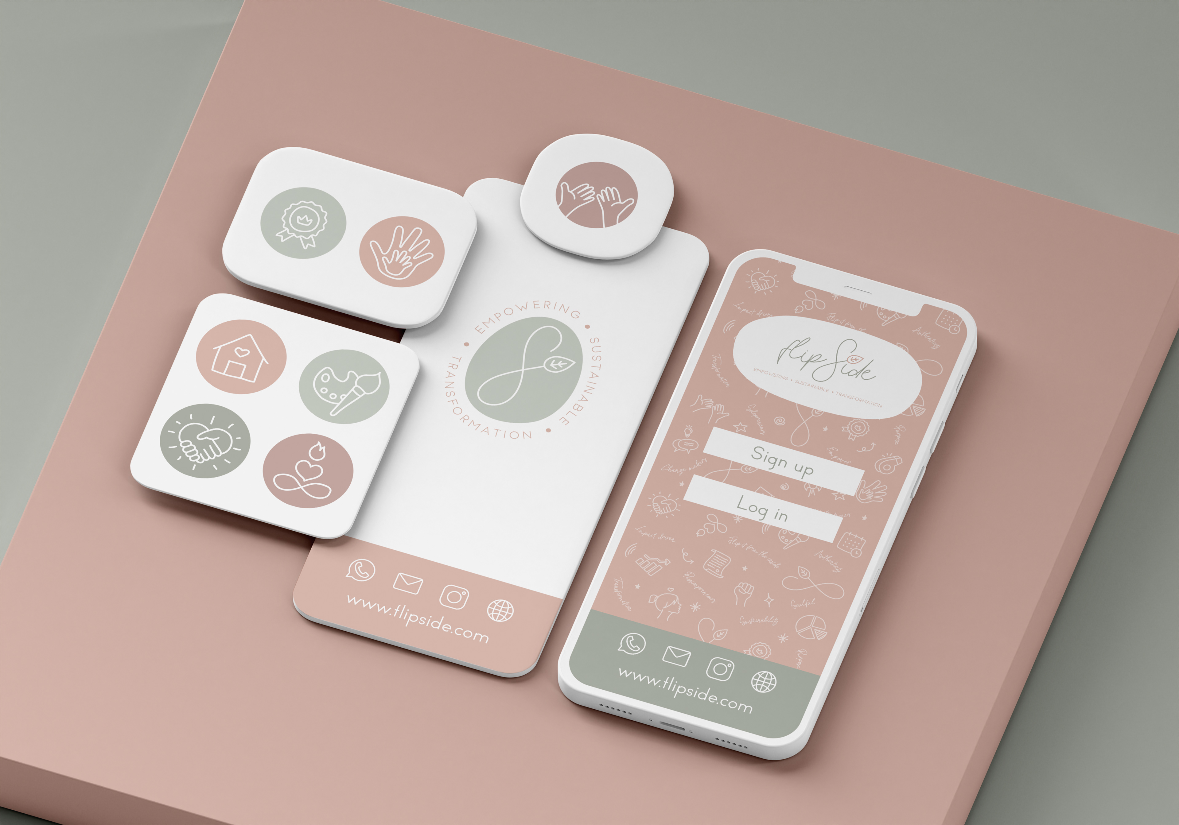
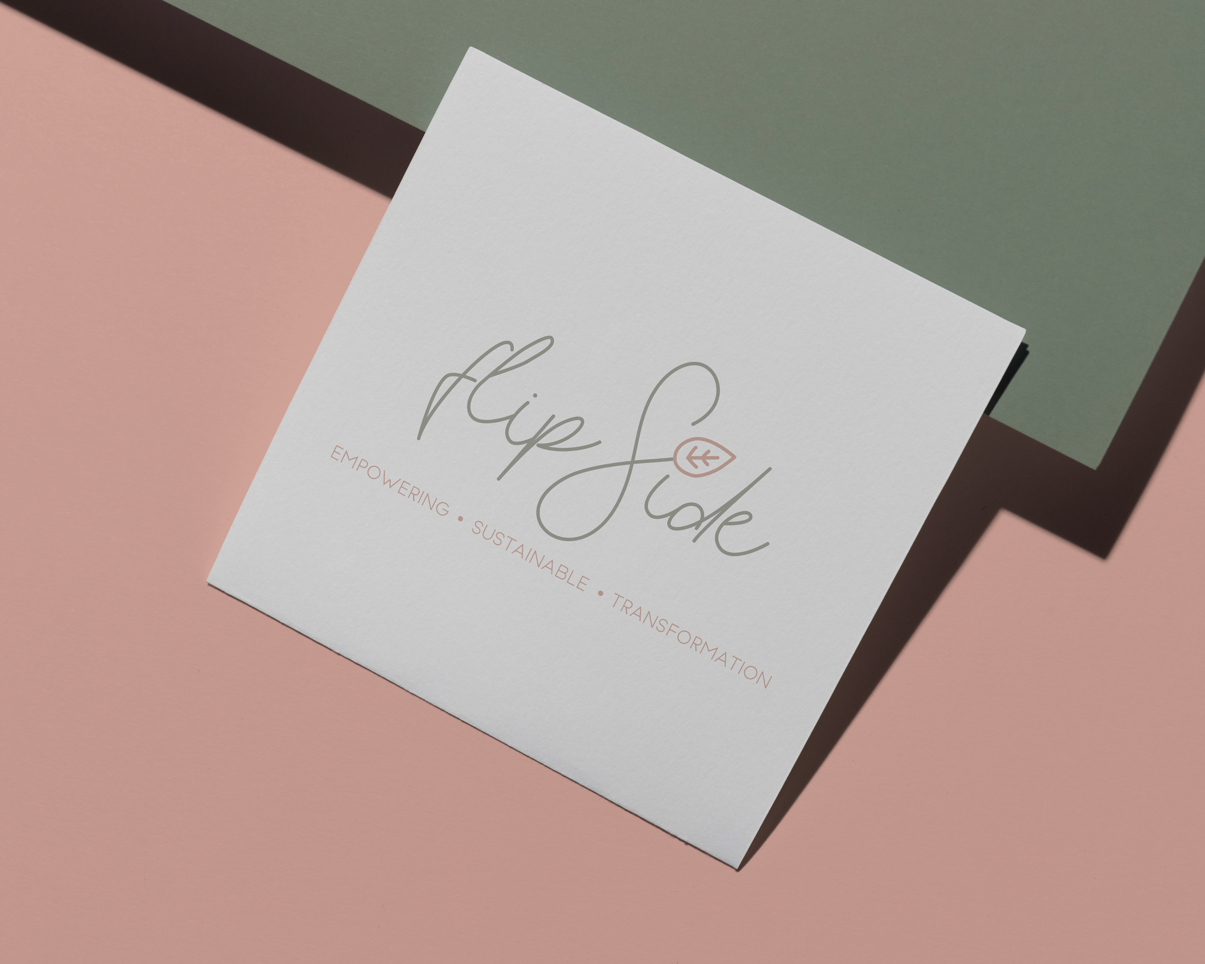
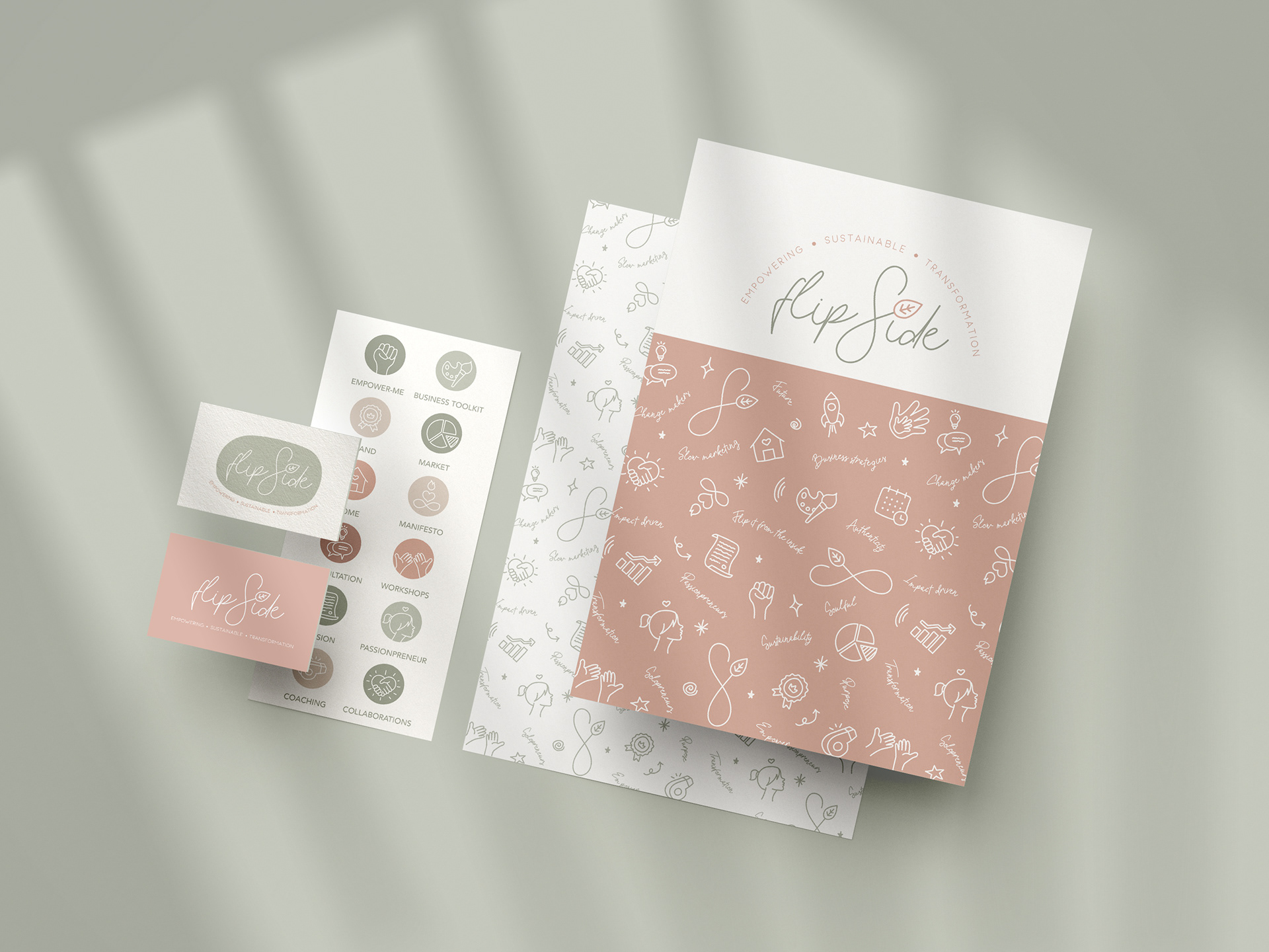
Creation of the brand identity from A to Z. Flipside is a marketing agency helping entrepreneurs and startups to magnify their projects. Flipside aims to flip it from the inside, and understand the core cause of their client to make it their purpose. The logo is inspired by the shape of the infinity sign to represent companies' transition / flipping from the inside. This symbol is integrated to the logo replacing the letter S, and also featuring a leaf that stands for sustainability and organic marketing. I wanted to give the brand a unique doodly and feminine look, imprinted with modernity and fun. I designed the whole brand identity, pattern and icons.