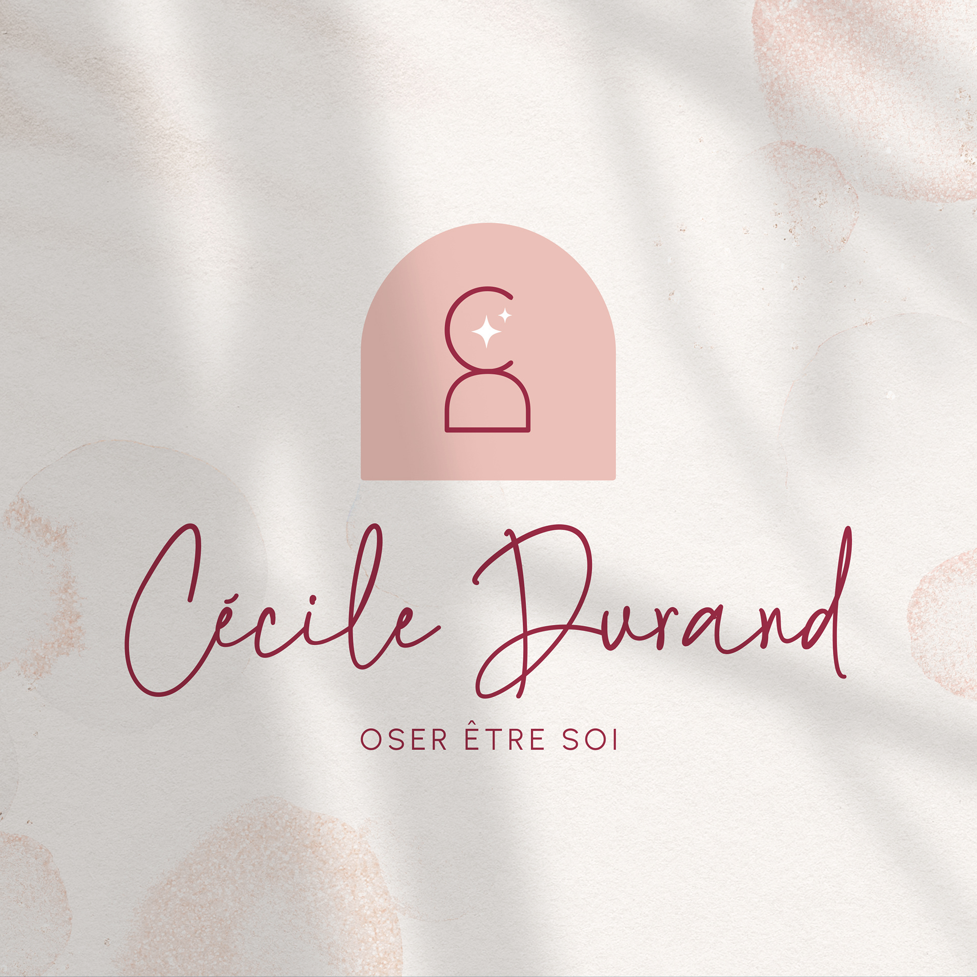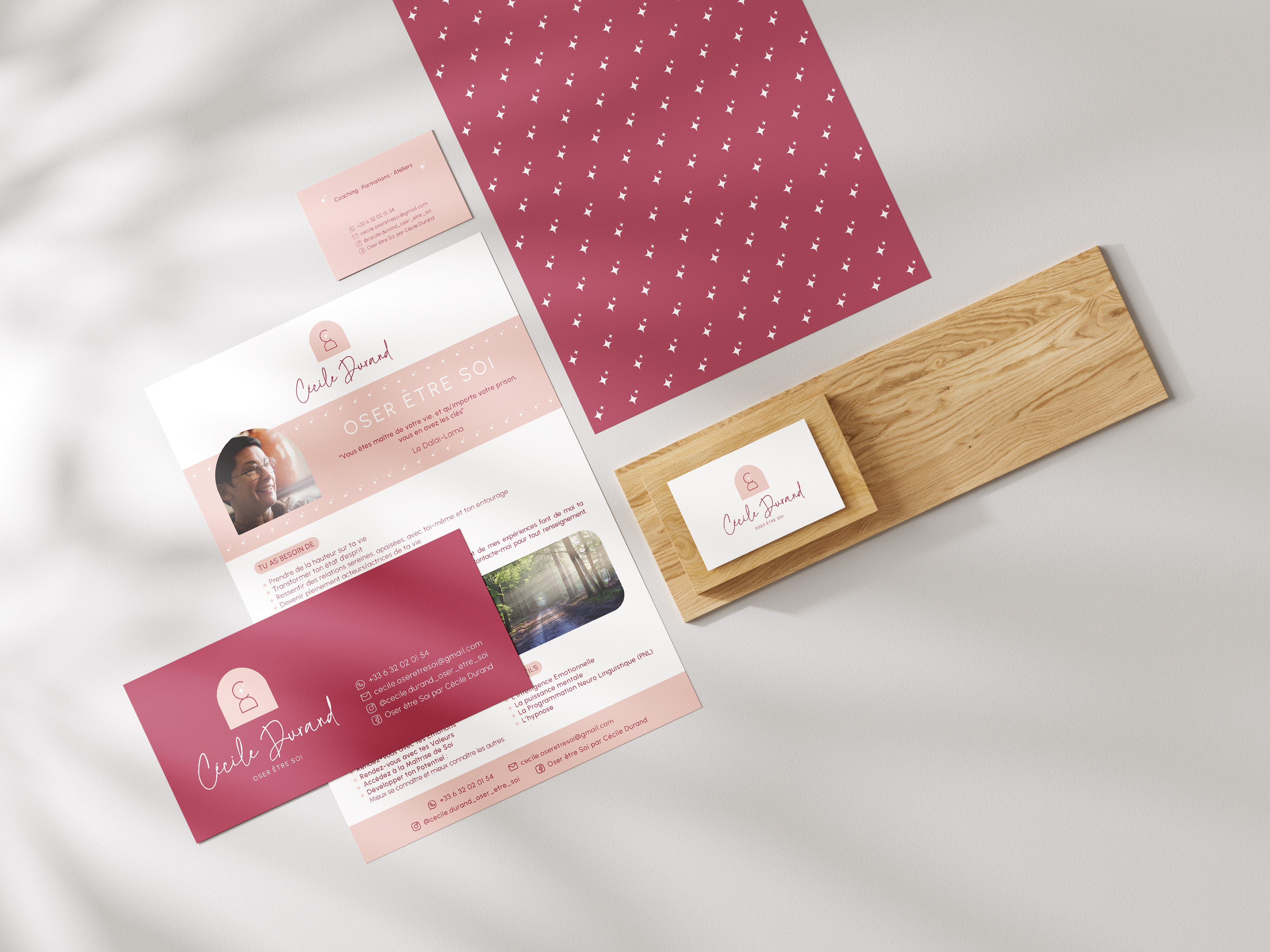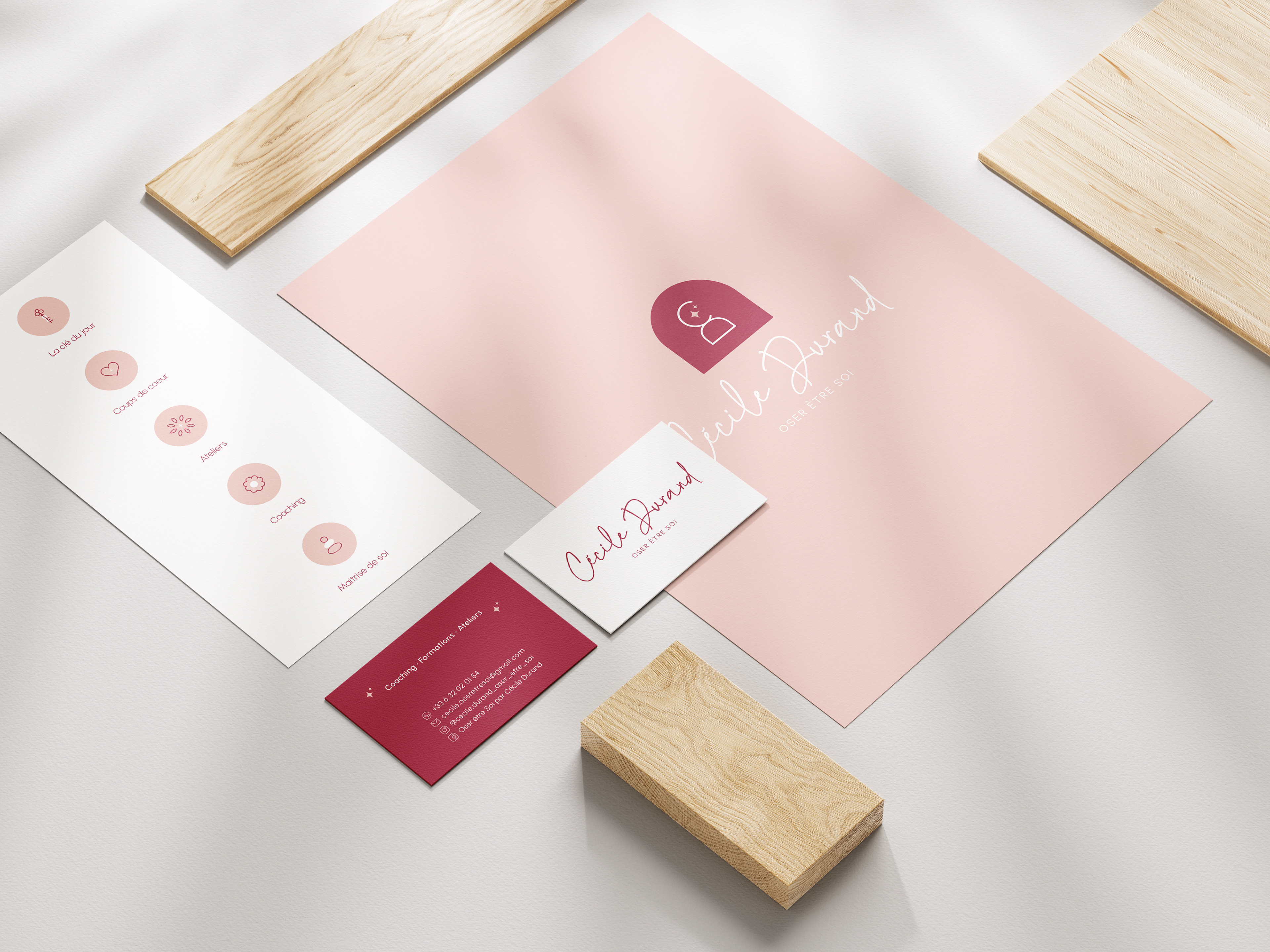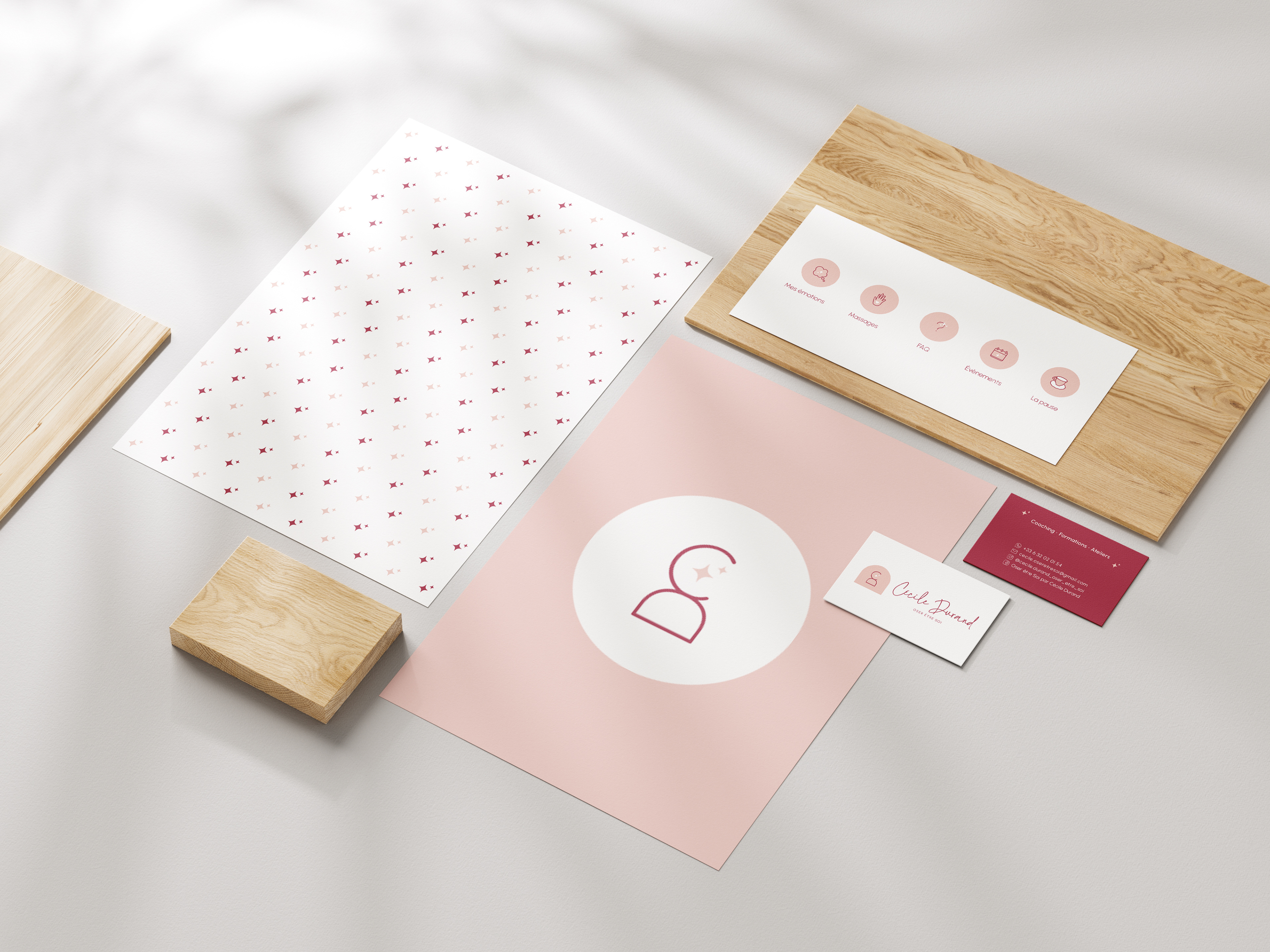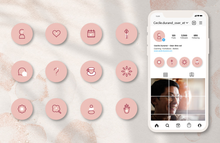
CÉCILE DURAND
LOGO & BRANDING
Creation of the brand identity from A to Z. Cecile Durand is a professional and personal coach. She offers coaching, workshops, and training to help people reach their full potential. The logo features unique, feminine typography, like a signature. The logo is very graphic and minimalist. The bow shape recalls the idea of a door, a passage, a journey towards oneself through coaching, but also symbolizes protection and benevolence. The coach's initials appear in the bow, representing both the silhouette of a person and an open padlock, representing the keys that coaching brings to self-understanding and self-knowledge, as well as openness to the world, to others, and to oneself. The color palette is feminine, soft yet dynamic. The overall logo is minimalist, delicate, and reassuring.