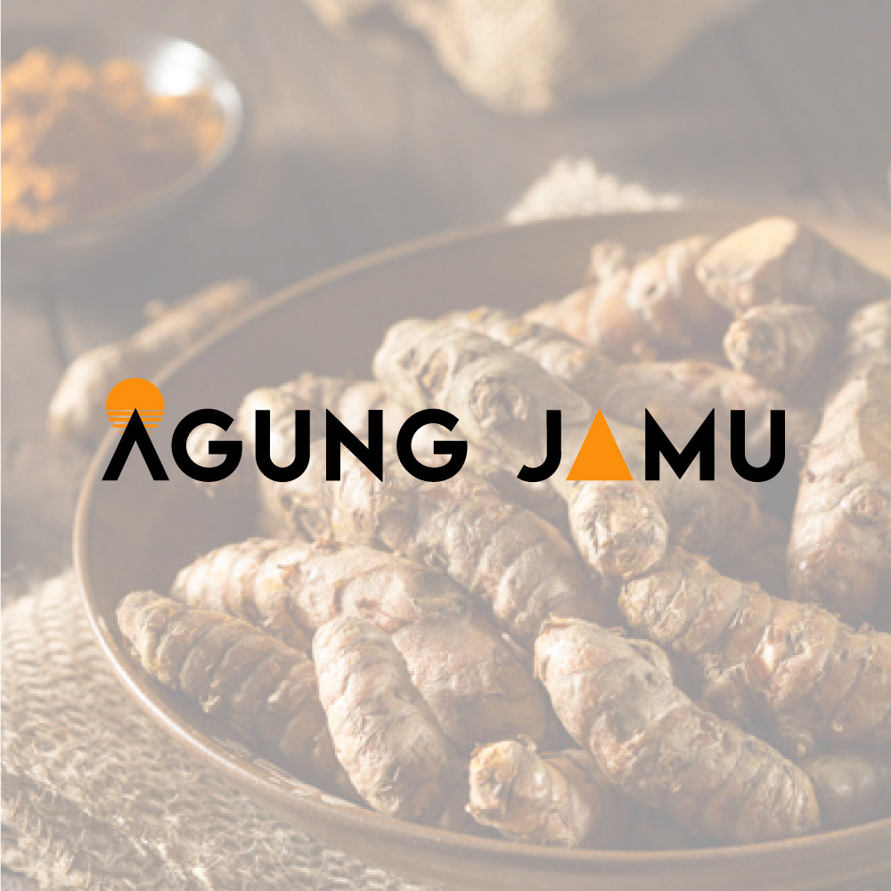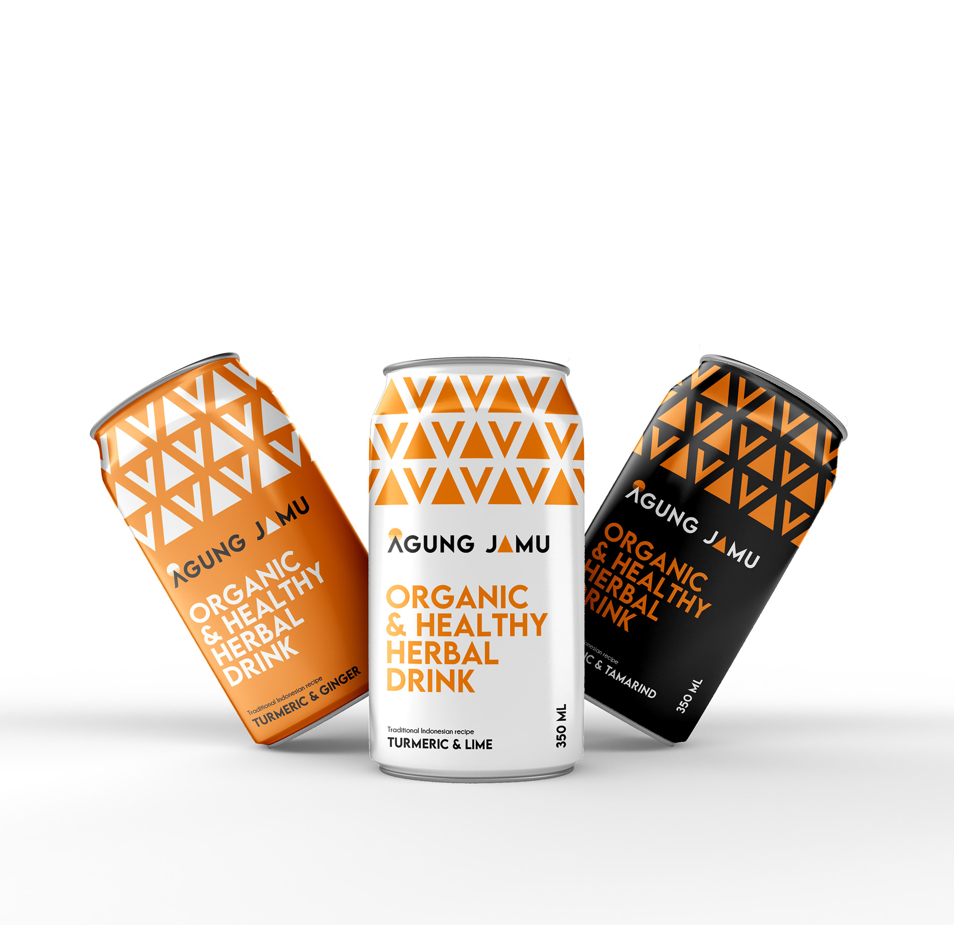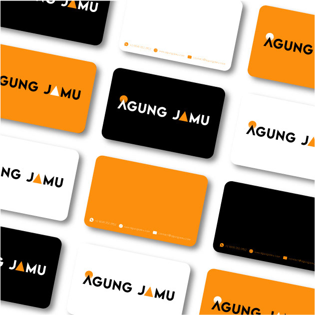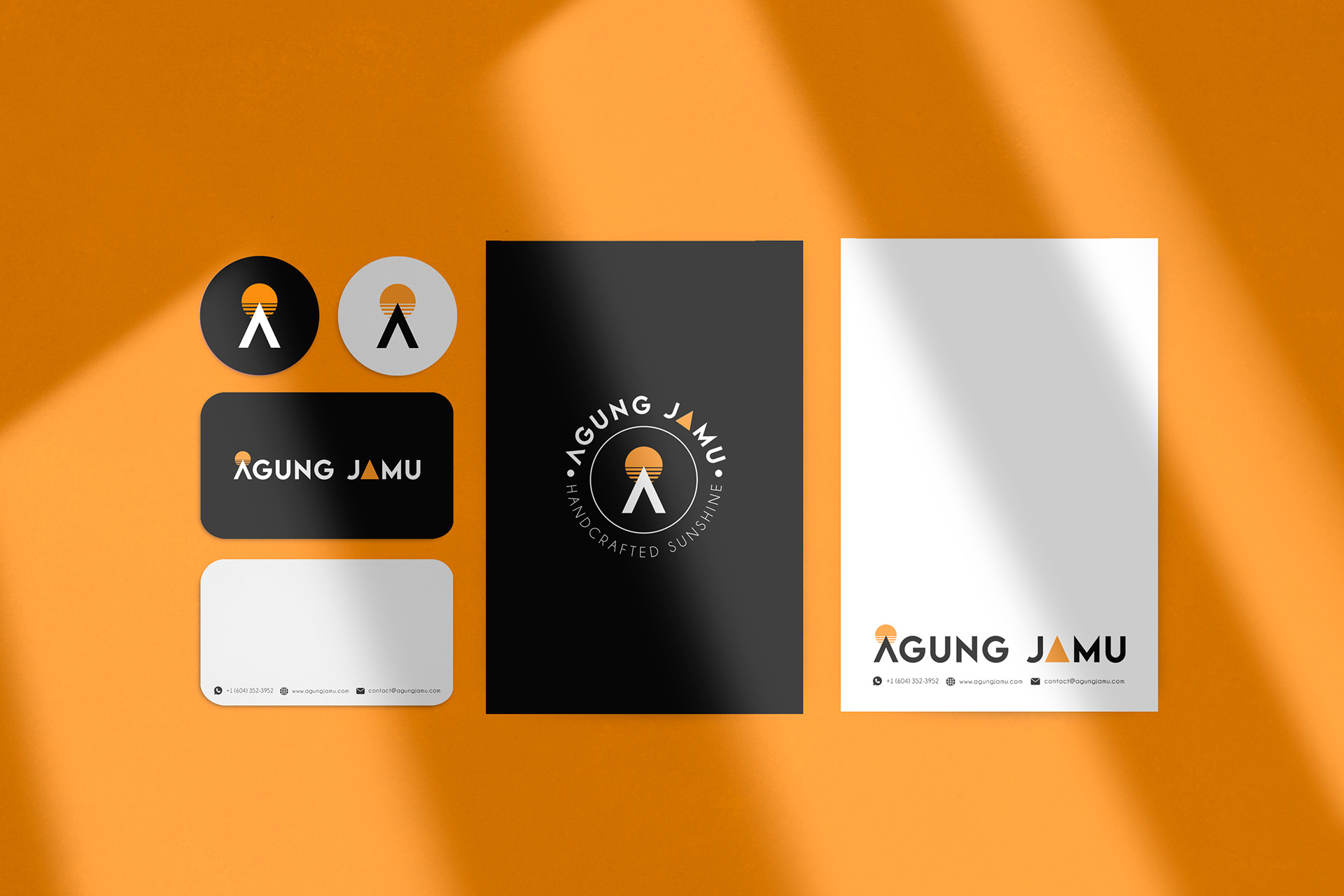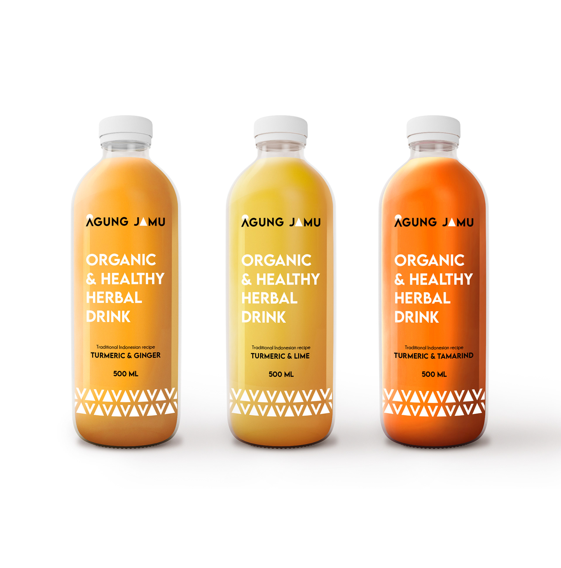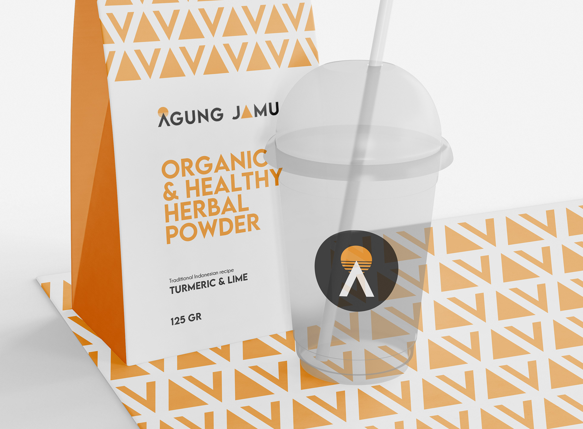
AGUNG JAMU
LOGO, BRANDING & PACKAGING
Creation of the brand identity from A to Z. AGUNG JAMU is a brand of organic and healthy herbal drinks, inspired by traditional Indonesian medicine. The Logo features a strong bold font to showcase the powerful taste of the drink. The logo is very graphic and minimalistic. The shape of both A stands for the Agung volcano, the first is a silhouette and the second is a full orange triangle that echoes the sunset shape behind the first A. The orange color is a reflection of the turmeric based drink. The overall feel of the logo is minimalistic, strong, and bright.